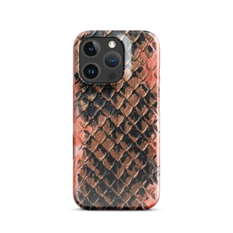
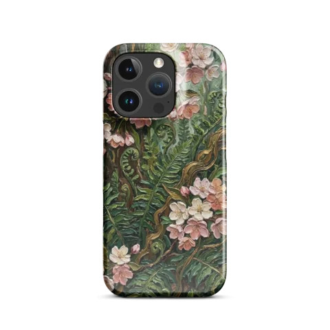
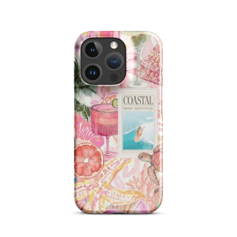
High-quality custom cases are not random. They come from repeatable decisions: source quality, contrast control, finish choice, and placement checks.
Resolution planning
Start with clean source material. If your design has tiny texture details, they need enough pixel information to survive real print dimensions.
Color and contrast strategy
Strong contrast usually reads better at normal viewing distance. Avoid very dark-on-dark compositions unless intentional and tested.
Glossy vs matte: practical difference
- Glossy often increases color pop and vibrancy.
- Matte reduces reflections and can feel more subtle.
Edge-safe placement
Keep key details away from critical zones around camera areas and outer edges. This reduces visual clipping risk and improves final composition balance.
Pre-check before checkout
- Zoom and inspect key details.
- Confirm readability of text elements.
- Compare the same design across case types.
FAQ
Can AI-assisted designs print at premium quality?
Yes, when image quality and finishing decisions are handled correctly.
Should I always pick glossy for color?
Not always. Matte can be better for minimal styles and lower-reflection look.
Can I improve an old design without starting over?
Yes. Contrast and composition adjustments often create major improvement quickly.
Next step: Create your own, then compare options in Products.
External reference: Color model fundamentals.